Originally Posted on MonsterInsights by Remo Finderup
Are you looking to improve your website user experience to keep visitors happy, encourage them to stay longer, and improve your user journey?
When your site is user-friendly, visitors are more likely to stay longer and return. They are also more likely to engage with and purchase from your website, which is great for its growth and success.
In this article, we’ll provide 11 simple tips to help you make your website better for everyone. We’ll also look at some great examples from other websites and discuss why user experience is so important.
Here’s what we’ll cover:
- How to Improve Your Website User Experience
- The Importance of User Experience
- Frequently Asked Questions
How to Improve Your Website User Experience
Improving your website user experience can make a big difference in how visitors feel about your site. A good user experience means visitors can find what they need easily and enjoy their time on your pages.
This keeps them happy and is also good for your business reputation, growth, and conversions. If people don’t like your site, they will leave quickly, which is bad news for SEO and making sales.
Let’s take a look at 11 simple tips for avoiding this and improving your website user experience.
- Optimize Your Page Speed
- Use White Space
- Have Visuals
- Use Headlines Correctly
- Have Clear Calls to Action
- Master Readability
- Keep Consistent
- Be Responsive and Mobile-Friendly
- Fix 404 Errors
- Have a Good Link Structure
- Keep it Simple
1. Optimize Your Page Speed
No one likes a slow website, and search engines know this too. That’s why they consider page speed when ranking sites, and Google implemented their core web vital scores in 2021.
If your site is slow, visitors might bounce off, which is bad for SEO and sales.
For WordPress users, there are several plugins to help speed up your site. Plugins for caching and image optimization can make a big difference. In general, you want to:
- Compress images: Use tools or plugins to make image files smaller.
- Enable browser caching: This allows your site to load faster for repeat visitors.
- Minimize JavaScript and CSS: Reduce the amount of code on your pages to speed up loading times.
A fantastic tool to consider when checking your website speed is MonsterInsights. It’s the top Google Analytics plugin you can install on your site, and you don’t need to deal with any code.
MonsterInsights offers numerous benefits and features, such as ensuring compliance with privacy regulations (like GDPR), tracking form submissions, and monitoring the performance of eCommerce websites.
The plugin also shows you a site speed report right in your WordPress dashboard.
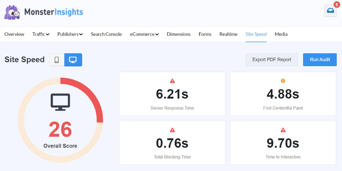
It also gives you tips on making your site faster so you can easily follow along and fix anything that is messing with your speed.
For other website owners, Google’s PageSpeed Insights is a free tool to check your website’s performance.
Just enter your URL, and it will show you how fast your site is and provide tips on improving your Core Web Vitals scores.
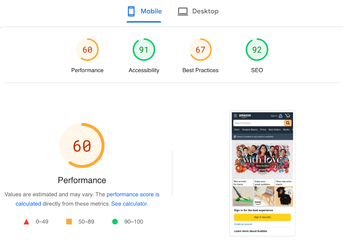
Remember, a fast website keeps visitors happy and helps your business grow by improving SEO and increasing conversions.
2. Use White Space
Some people think having too much white space is bad because it takes up room that could be used for ads or other content. But white space is actually very important for good design and user experience.
It makes your content easier to read and helps users focus on what’s important. Studies conducted by Wichita State University show that white space around text and titles can increase user attention by 20%.
See, for instance, the website of Clay, a UX (user experience) agency, and their use of white space and simplicity:
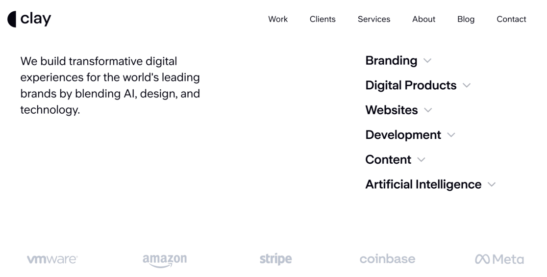
White space doesn’t have to be white; it can be any color that fits your design. It can also make your website feel open, fresh, and modern, matching your brand’s style.
However, one thing to remember is that white space takes up space. If you want a lot of content at the top of your page (the part you see without scrolling), too much white space might push some of it down.
The key is to find a balance, putting important things at the top while still using enough white space to make everything look good.
The important thing is to have enough empty space between parts of your page so users don’t get overwhelmed and confused.
3. Have Visuals
Using visuals is a great way to make your website more engaging and fun. Pictures, videos, and graphics help break up the text, making your content easier and more enjoyable to read. It also allows you to communicate messages and create a brand identity creatively.
However, it’s important to use the right kind of visuals.
Stock images are not recommended because they often look generic and don’t connect well with your unique message. Also, if people have seen the same stock on other websites, it can even make your site seem untrustworthy – yikes!
Instead, try to use:
- Original photos: These show real people, products, or events related to your business.
- Infographics: These are great for explaining complex information in a simple way. You can even create them yourself using a free tool like Canva.
- Videos: These can capture attention quickly and explain your message effectively.
- Custom graphics: These can be designed to match your brand and make your site look more professional.
Using original and relevant visuals will make your website look more authentic and engaging, improving the overall user experience.
4. Use Headlines Correctly
Make sure you have good headlines so visitors can easily scan what your pages and posts are about.
Headlines help break up your content into sections, making it easier for people to find what they want. You can also create a table of contents with your headlines, letting people jump to the section that interests them the most.
For example, no one wants to read an entire email marketing strategy if they just want to know how often to send out a newsletter.
Headlines are also important for SEO because they help search engines understand your content.
Here’s how to use different headline levels:
- H1 (Main title): Use this for the main title of your page or post. There should be only one H1 per page. Example: ‘The Ultimate Guide to Email Marketing.’
- H2 (Subheadings): Use these for the main sections of your content. They help break your content into key parts. Example: ‘1. Building Your Email List.’
- H3 (Sub-subheadings): Use these for subsections under your H2 headings. They provide more detail. Example: ‘a. Using Signup Forms’
- H4 (Additional details): Use these for smaller sections under H3 headings if needed. They add further detail. Example: ‘i. Best Practices for Signup Forms.’
Using headlines correctly helps make your content easy to navigate for both users and search engines, improving the user experience and boosting your search rankings.
That’s a pretty big win!
5. Have Clear Calls to Action
Having clear Calls to Action (CTAs) is essential for a great user experience.
CTAs make it easy for people to know what to do next on your website. They guide visitors to take specific actions, like signing up for a newsletter or purchasing, which can help grow your business.
They also increase engagement by encouraging users to interact more with your site and boost conversions by leading to more signups, sales, and other valuable actions.
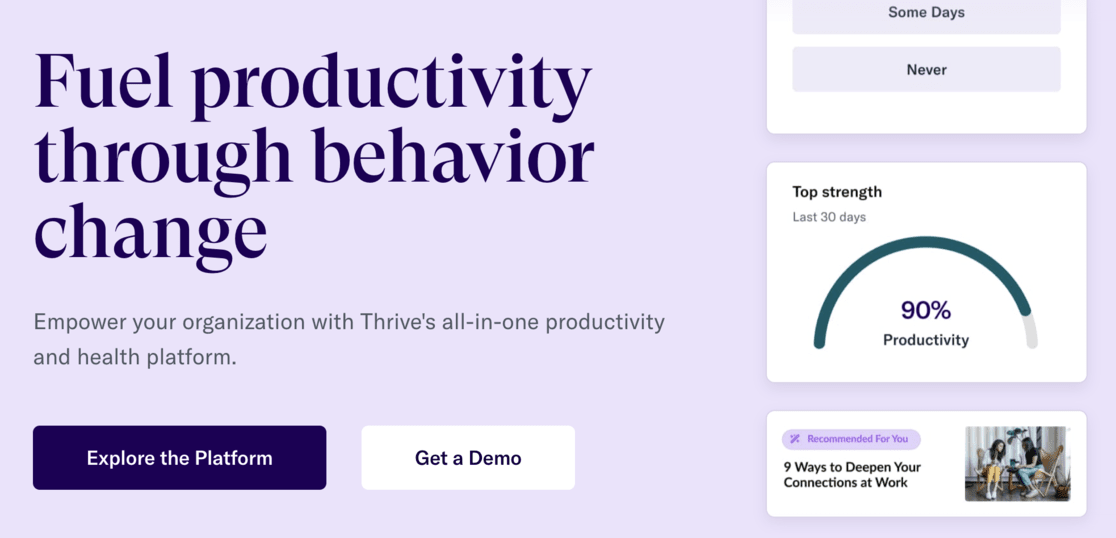
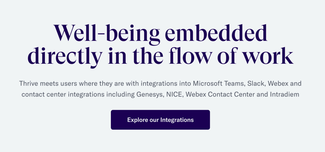
See a few examples below of clear and appealing CTA’s from Thrive Global marketing:
For WordPress users, the best lead generation tool to use is OptinMonster.
OptinMonster is the world’s #1 lead generation tool. It helps online business owners and marketers grow email lists quickly, sell more products, and keep visitors on your site longer.
OptinMonster lets you create various opt-in campaigns, such as popups, floating bars, and fullscreen welcome mats.
When creating CTAs, consider color psychology. Different colors evoke different feelings, so choose colors that match the message you want to convey, such as trust (blue) or excitement (red).
Also, use verbs or action words that motivate users to act. Words should be time-sensitive and action-oriented to create an emotional connection.
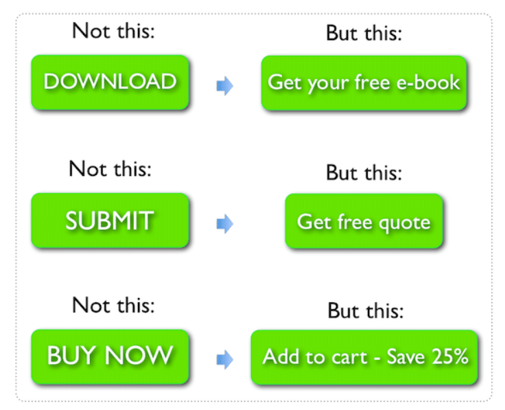
Clear and compelling CTAs can more effectively guide users through your website, improving their experience and helping your business grow.
6. Master Readability
People rarely read the content on a website deeply; they scan it. So mastering readability is important for giving readers a quick and easy overview of your offer.
To master readability, break up your text into short paragraphs and use headings and subheadings to organize your content, making scanning easier.
Ensure your text does not fill the entire screen; having no more than 60-70 characters per line is recommended. This might seem surprising, but reading on a screen is different from reading a book. Using sidebars helps make the reading experience better by narrowing the width of the text.
Also, consider your font size and the contrast between text and background. Ensure your font is large enough to read easily and the contrast is strong enough to prevent eye strain.
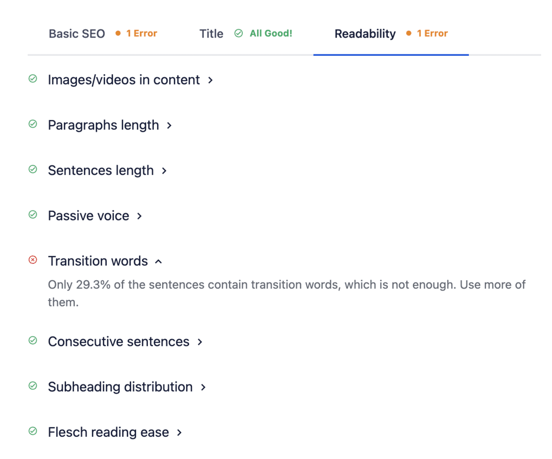
The best way to check your readability is by using an SEO tool. The All in One SEO (AIOSEO) plugin is best for WordPress users.
AIOSEO is user-friendly and offers an SEO Analysis Tool in your WordPress dashboard. This tool monitors your site, points out critical issues, and provides helpful tips to attract visitors and improve your keyword rankings.
Besides SEO recommendations, AIOSEO also gives tips on improving your readability, ensuring your content is user-friendly and search engine-friendly.
7. Keep Consistent
Consistency means matching everything, from heading sizes and font choices to colors and button styles. This includes spacing, design elements, illustration styles, and photo choices.
Everything should have a common theme to make your design cohesive across all pages.
Users who navigate your site should always feel like they are still on the same website. If your design changes drastically from one page to another, users can feel lost and confused, which might make them leave early.
Consistency helps users feel confident and comfortable as they explore different pages. It also improves the overall quality of the user experience and helps build trust with your visitors.
So, ensure your website’s design elements are the same across all pages. This will look good and make your site easier to use, ensuring visitors feel at home wherever they click.
8. Be Responsive and Mobile-Friendly
Your website must be responsive and mobile-friendly. Google now follows a mobile-first philosophy when ranking websites. This means that if your site isn’t optimized for mobile devices, it won’t rank as well in search results.
Nowadays, more people browse the internet using their phones. Why go grab your computer when you have what you need right in your pocket?
But this convenience only works if sites are mobile-friendly and responsive. If it isn’t, visitors might leave and find another site that is.
To ensure your website is responsive, here are some tips:
- Use a mobile-friendly theme: Choose a theme designed to be responsive, meaning it will adjust to look good on any device.
- Test on different devices: Regularly check your site’s appearance on various screen sizes, including smartphones, tablets, and desktops.
- Optimize images and media: Make sure your images and videos are sized appropriately to load quickly and display well on smaller screens.
- Simplify navigation: Ensure your menu and navigation are easy to use on a mobile device, with clear, tappable buttons.
This will ensure that users have a great experience no matter how they access your site.
9. Fix 404 Errors
404 errors are really bad for user experience, and search engines hate them too.
When visitors click on a link that leads to a page that doesn’t exist, they see a ‘404 not found’ error. This is frustrating for users.
These errors can happen for various reasons, such as moving your site to a new domain, deleting a page, or even making a typo in the link.
Having many broken links can hurt your site’s SEO. Both search engines and visitors can get lost trying to find pages that aren’t there, which can lower your rankings and negatively affect your website’s overall user experience.
Luckily, fixing these links doesn’t have to be difficult. Using Google Analytics with MonsterInsights will help you easily track down 404 errors.
Another great tool is the Broken Link Checker plugin by AIOSEO. It thoroughly searches your site for broken links and allows you to fix them with just a few clicks.
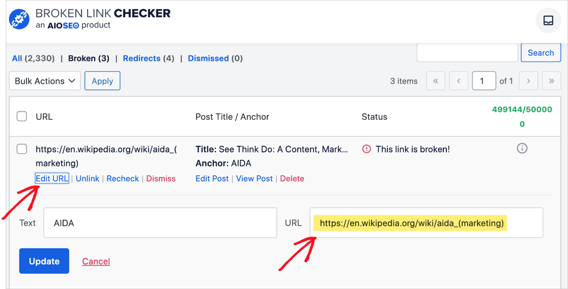
If you have broken links because you changed post URLs, deleted content, or moved your site, you can fix them with 301 redirections.
This is like putting up a sign that directs traffic from the old link to a new page. The easiest way to set up these redirects is by using AIOSEO’s redirection manager.
Fixing 404 errors will improve user experience and keep search engines happy, which is essential for maintaining good SEO and keeping your visitors satisfied.
10. Have a Good Link Structure
A good link structure naturally guides users through your website. It helps visitors find relevant content easily and keeps them engaged. A well-structured website also makes navigation smooth and intuitive, enhancing the overall user experience.
When you add a link to any page, you encourage the user to click there. Ensure links are easily identifiable using visual cues like underlined text and different colors. This draws the reader’s attention and lets them know this is a link to be clicked on.
Ensure your link’s anchor text is clear about where they will take the user. Instead of saying ‘Click here’ to read more, use descriptive text like ‘Read our guide on email marketing’ to make the link obvious. This improves usability and helps SEO by providing search engines context about the linked page.
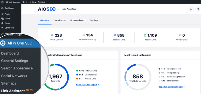
For WordPress users, AIOSEO has a great feature called Link Assistant. This helps you find pages that could use more internal links and even points out ‘orphaned posts’ – pages that don’t have any internal links at all.
It also suggests what to link and what words (anchor text) to use. You can add these links to your content with just one click, making the whole process of building links super easy.
Maintaining a good link structure enhances the user experience, makes your site more SEO-friendly, and ensures visitors can easily navigate and find the necessary information.
11. Keep it Simple
Last but not least, a good user experience comes from keeping things simple.
Think about fewer clicks, fewer tasks, less information overload, and fewer distractions or confusing elements when designing your website.
If you’re debating whether something is necessary, you can probably remove it.
Highlight your key bits of information clearly and avoid clutter. Users should be able to find what they need quickly and easily. You can always give them the option to unfold and read more or click through to a full page if they want extra information.
Simplicity also helps reduce users’ cognitive load. Users become overwhelmed and frustrated when they have to think too much or simultaneously deal with too many elements.
A simple, well-organized website improves user satisfaction and encourages users to stay longer and engage more with your content.
Remember, less is often more when it comes to creating a great user experience!
The Importance of User Experience
After all these tips, what you can do to improve your user experience should be clear, but why is it so important?
- Increases user satisfaction: A good user experience makes visitors happy, encouraging them to stay longer and return to your site.
- Boosts conversions: When users find your site easy to navigate and enjoyable to use, they are more likely to complete desired actions like making a purchase or signing up for a newsletter.
- Enhances SEO: Search engines favor websites that offer a great user experience, which can improve your rankings and increase organic traffic.
- Builds trust and credibility: A well-designed, user-friendly website helps establish trust and credibility with your audience, making them more likely to rely on your site for information or services.
- Reduces bounce rates: A positive user experience reduces visitors’ likelihood of quickly leaving your site, helping to lower bounce rates and keep users engaged.
- Encourages word-of-mouth: Satisfied users are likelier to recommend your site to others, driving more traffic and potential customers to your business.
By prioritizing user experience, you make your website more enjoyable for visitors and support your business’s overall success and growth.
Frequently Asked Questions
These are some frequently asked questions about how to improve user experience on a website:
What is a website user experience?
Website user experience (UX) refers to how visitors feel when interacting with your website. It includes ease of navigation, how quickly pages load, the clarity of information, and the overall satisfaction users have. A good UX ensures users find what they need effortlessly and enjoy their visit.
What is the difference between UI and UX?
User Interface (UI) refers to the visual aspects of a website, such as layout, colors, and buttons. User Experience (UX), on the other hand, encompasses the website’s overall feel, including usability, accessibility, and how enjoyable it is to use. UI is about looks, while UX is about functionality and satisfaction.
What are the basics of user experience?
The basics of user experience (UX) involve creating a website that is easy to use, meets users’ needs, and provides a pleasant interaction. This includes ensuring fast page load times, using clear and intuitive navigation, employing effective use of white space, maintaining consistency in design, and making sure the site is mobile-friendly.
Do I need a UX designer for my website?
No, you don’t necessarily need a UX designer. By implementing the tips we provided above, you are well on your way to creating a great user experience. However, a UX designer can be great for more complex projects or if you struggle with web design.
That officially wraps up this tutorial on improving your website user experience. We hope you found it helpful in improving your website and making your visitors happier.
If you liked this article, maybe you’d also like to read:
- 8 Best Website Builders for Small Businesses
- How to Get More Traffic on WordPress (15+ Ways)
- How to Master SEO Search Intent to Improve Your Rankings
Haven’t gotten started with MonsterInsights yet? Get started today!
And don’t forget to follow us on X, Facebook, and YouTube for more helpful website, SEO, and Google Analytics tips.
The post How to Improve Your Website User Experience (11 Tips) appeared first on MonsterInsights.


