


Originally Posted on Martech Zone by Douglas Karr

Smartphones have become ubiquitous, yet the mobile-first design is secondary to many companies attempting to engage and retain customers. With most internet users now accessing websites via mobile devices, companies must prioritize mobile optimization to remain competitive and provide seamless user experiences. This article delves into the concept of mobile-first design, discusses Google’s requirements for mobile-optimized websites, and highlights the importance of adopting this approach in the current market.
The Rise of Mobile Internet Usage
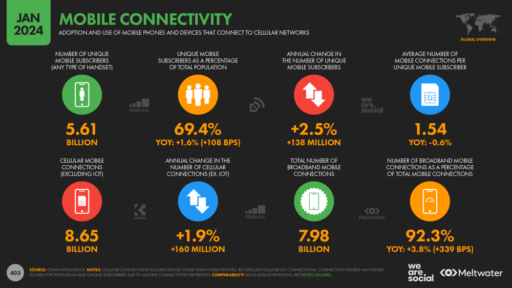
Over the past decade, the rapid proliferation of mobile devices has revolutionized how people interact with the internet. According to recent statistics, over half of all web traffic worldwide is generated through mobile phones.

This shift in user behavior has significant implications for businesses, as failing to cater to mobile users can result in lost opportunities, reduced engagement, and, ultimately, a decline in revenue.
Understanding Mobile-First Design
Mobile-first design is a web design approach that prioritizes the mobile user experience from the outset. Instead of designing for desktop screens and then adapting the layout for smaller devices, mobile-first design begins with the smallest screen size and progressively enhances the design for larger screens. This methodology ensures that mobile users receive an optimal experience with fast loading times, intuitive navigation, and content that is easily accessible on smaller screens.
Google’s Requirements for Mobile-Optimized Websites
Google, the world’s leading search engine, has recognized the importance of mobile-first design and has set specific requirements for websites to be considered mobile-friendly. These SEO requirements include:
- Easy Navigation: Menus and buttons should be easily tappable with fingers, and the overall navigation structure should be intuitive and user-friendly.
- Fast Loading Times: Mobile users expect websites to load quickly, and Google recommends a loading time of under three seconds. Slow-loading websites can lead to high bounce rates and poor user engagement.
- No Third-Party Dependencies: To ensure maximum compatibility and performance on mobile devices, websites should rely on native HTML, JavaScript, and AMP (Accelerated Mobile Pages) for rendering content. Avoid using third-party plugins or components that may not be supported across all platforms or could negatively impact loading times. By leveraging web standards and technologies natively supported by mobile browsers, companies can deliver a seamless and accessible user experience to their mobile audience.
- Minimal Pop-ups and Interstitials: Intrusive pop-ups and interstitials can frustrate mobile users and hinder their access to content. Google recommends minimizing their use or avoiding them altogether.
- Optimized Images and Videos: Large media files can significantly slow mobile network loading times. Images and videos should be compressed and optimized for faster loading while maintaining acceptable quality.
- Readable Text: Font sizes should be large enough to read comfortably on small screens without zooming or scrolling horizontally.
- Responsive Design: Websites should adapt seamlessly to different screen sizes, ensuring content is easily readable and navigable on smartphones and tablets.
- Safe Browsing: Obtain an SSL certificate, enforce HTTPS connections, and regularly scan your site for malware to ensure it’s free of deceptive content.
Mobile Device Feature Access and the Rise of Web Applications
In recent years, advancements in mobile browsers and JavaScript libraries have unlocked a wealth of possibilities for web applications, enabling them to access and utilize various mobile device features. This development has significantly narrowed the gap between native mobile apps and web-based applications, leading to a surge in the popularity of web apps for mobile application development.
Mobile browsers and JavaScript libraries now provide APIs and frameworks that allow web applications to interact with a wide range of mobile device features, including:
- Geolocation (GPS): Web apps can access the device’s GPS to provide location-based services, such as navigation, location-aware content, and proximity-based features.
- Camera and Microphone: With user permission, web applications can access the device’s camera and microphone, enabling features like video conferencing, QR code scanning, and augmented reality experiences.
- Accelerometer and Gyroscope: These sensors detect the device’s motion and orientation, allowing web apps to respond to gestures, enable immersive gaming experiences, and provide interactive user interfaces.
- Push Notifications: Web applications can now send push notifications to users’ devices, even when the app is not actively running, enhancing user engagement and retention.
- Offline Capabilities: Modern web technologies like Service Workers and the Cache API enable web apps to work offline or in low-connectivity environments, providing a seamless user experience.
- Haptic Feedback: Web applications can trigger vibrations and haptic feedback on mobile devices, enhancing user interaction and creating immersive experiences.
- Bluetooth: Web apps can communicate with Bluetooth devices, enabling features like wireless data transfer, device control, and proximity-based interactions.
- Near-Field Communication (NFC): With the Web NFC API, web applications can read and write NFC tags, opening up possibilities for contactless payments, device pairing, and information sharing.
The ability to access these mobile device features has significantly empowered web applications, making them a viable and attractive alternative to native mobile apps. Web apps offer several advantages over native apps, including:
- Cross-platform compatibility: Web applications can run on any device with a compatible web browser, eliminating the need for separate iOS and Android app development.
- Instant updates: Updates to web apps are immediately available to users without needing app store approval or manual installation.
- Reduced development costs: Developing and maintaining a single web application is often more cost-effective than building and updating separate native apps for multiple platforms.
- Improved discoverability: Web applications are easily discoverable through search engines and can be shared via URLs, reducing the barrier to entry for users.
As a result of these advantages and the growing capabilities of web technologies, many companies are now opting for web-based mobile application development. This trend is expected to continue as web standards evolve and new APIs are introduced, further closing the gap between web and native apps.
Don’t get me wrong… native mobile apps still have their place, particularly when it comes to complex applications that require extensive access to device features or demand the highest levels of performance. The choice between web and native app development ultimately depends on the specific requirements and goals of the project.
The Importance of Mobile-First Design for Businesses
Adopting a mobile-first design approach is no longer optional for businesses; it has become a necessity. Here’s why:
- Improved User Experience: By prioritizing the mobile user experience, companies can ensure that their websites are accessible, navigable, and engaging for the growing majority of mobile users. A positive user experience can increase customer satisfaction, loyalty, and conversions.
- Competitive Advantage: As more businesses optimize for mobile, companies that fail to do so risk falling behind their competitors. A mobile-friendly website can differentiate a business and attract customers who value convenience and accessibility.
- Better Search Engine Rankings: Google has implemented mobile-first indexing, which means that the mobile version of a website is used as the primary source for indexing and ranking. Unable mobile-optimized websites may suffer lower search engine rankings, reducing their visibility and organic traffic.
- Increased Conversion Rates: A well-designed mobile website can lead to higher conversion rates, as mobile users are often more goal-oriented and likely to make purchases or take desired actions when the experience is seamless and user-friendly.
As the digital landscape continues to evolve, mobile-first design has become a critical aspect of web development and digital marketing strategies. With most internet users now accessing websites through mobile devices, businesses must prioritize mobile optimization to remain relevant, competitive, and successful.
Tips for Ensuring Mobile-First Design Success
To ensure the success of your mobile-first design strategy, consider implementing the following tips:
- Staff Mobile Testing: Encourage your staff to regularly interact with every page of your website using their mobile devices. This hands-on approach will help identify any usability issues, content discrepancies, or design inconsistencies that may arise on different screen sizes and devices. Encourage your team to provide feedback and insights based on their mobile browsing experience to improve the website’s mobile performance continuously. Pay careful attention to testing conversions – forms, checkouts, etc.
- Mobile Testing Tools: Use mobile testing tools to assess your website’s mobile-friendliness and performance. Tools like Lighthouse and PageSpeed Insights can provide valuable feedback on your site’s mobile usability, loading speed, and optimization. Run these tests regularly and address any identified issues to maintain a high-quality mobile user experience.
- Google Search Console: Leverage Google Search Console to monitor your website’s mobile performance and identify potential issues. Follow these steps:
- Sign in to your Google Search Console account.
- Select your website from the property list.
- Navigate to the Mobile Usability report under the “Experience” section.
- Review the report to identify any mobile usability errors, such as small font sizes, touch elements being too close, or content wider than the screen.
- Address the reported issues to improve your website’s mobile-friendliness and search engine visibility.
- Google Analytics 4 Reporting: Use Google Analytics 4 (GA4) to gain insights into your website’s mobile performance and user behavior. Follow these steps to filter your GA4 reporting:
- Sign in to your Google Analytics account.
- Select your GA4 property from the property list.
- Navigate to the Reports section and select the desired report, such as Engagement or Conversions.
- Click the Add Comparison button and select Device Category as the dimension.
- Compare the performance metrics (e.g., bounce rate, conversion rate, average engagement time) across different device categories (mobile, desktop, tablet) to identify areas for improvement.
- Use these insights to optimize your mobile-first design, content, and user experience.
By implementing the tips outlined in this article, such as conducting regular mobile testing, utilizing Google Search Console and Analytics, and empowering your staff to engage with your website on mobile devices, you can ensure the success of your mobile-first design strategy and stay ahead of the curve in an increasingly mobile-centric world.
©2024 DK New Media, LLC, All rights reserved.
Originally Published on Martech Zone: Mobile-First Design: You’re Still Losing Too Many Opportunities Focusing on Desktop